It is crazy how much information we forget.
On average, people forget about 65% of what they hear in a presentation within just 24 hours of leaving the room. By day three, that number drops even further.

If you are leading corporate town halls, strategy workshops, or executive meetings, that is a massive loss of time and a terrible waste of an opportunity to align your listeners.
BUT, there there is a simple way to improve this.
If you add a relevant visual to that exact same spoken information, memory retention shoots up to 85%.
Most presenters add images to their PowerPoint slides. That helps. But these images are not always… how should I say this? …they are not always interesting, or pretty. Sometimes the banality of a piece of clip art or the glossy weirdness of an AI image is more distracting than helpful.
Your audience needs graphic recording
Our brains love images.
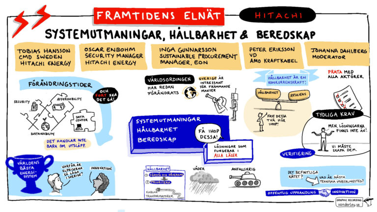
That is the beauty and the purpose of graphic recording. It summarises the content of a presentation with images and relevant icons (and this all happens live!)
Yes, it makes a corporate event look colorful, creative and fun. But more importantly, it acts as a cognitive anchor. It helps the human brain hold onto the ideas, frameworks, and facts that are being presented in real time.
When people see the concepts mapped out visually as they hear them, the information sticks.
A visual summary: one hour on one piece of paper
To show you what this looks like in practice, take a look at the image below.
This single piece of paper compresses a complex, 60-minute conversation into six clear key points.

During this specific session, Claire Venus and Georgina Dean discussed the creative process and the benefits of an online book-writing club. Lots of people listened to their discussion. Lots of people were probably also sending text messages, checking social media, or wondering if they had turned the iron off as they were listening.
Instead of asking participants to read a long text summary or re-watch an hour-long recording, Claire and Georgina now have a visual map that they can send to participants and use on social media.
Who reads visual summaries?
Visual summaries are useful both as an engaging reminder to participants and as a tool to awaken curiosity in people who didn’t see or hear the original session.
- For listeners: A quick glance will remind them of what they heard, cementing it in their memories.
- For non-listeners: The illustrations and clear headings are perfect for piquing curiosity and driving post-event engagement.

Planning a corporate event for early autumn? Don’t wait until August to contact a graphic recorder.
August and September are busy months for graphic recorders. I’d hate for you to miss out on visual documentation for your big event!
Send a quick email to megan@vanderley.se (or use this form) and let me know:
- When: date and approximate times
- Where: location (or if it’s a hybrid/remote event)
Get a tailored quote within 24 hours
I will send you a tailored quote within 24 hours. It will include options for remote attendance, in-person attendance, and digital and analog recording.
- In-person live sketching (analog or digital)
- Remote/Virtual graphic recording (digital)
Obviously, this quote is non-binding.
Bonus: my “Convince Your Boss” guide
I’ve put together a gorgeous illustrated guide to the benefits of graphic recording. It’s called “Convince your boss”, because I know that my clients sometimes need a little help to get their good ideas approved.
This document will help you justify the ROI of live visual note-taking to management. You can email it to them, or click through it as a presentation. It’s ready to go.
More information about graphic recording?
Right this way. There’s a lot of very useful information in the FAQ on this page.